Street Address
City, State, Zip
214-886-1928
Creative Director | Art Director | Brand Builder
Your Custom Text Here
Your Custom Text Here
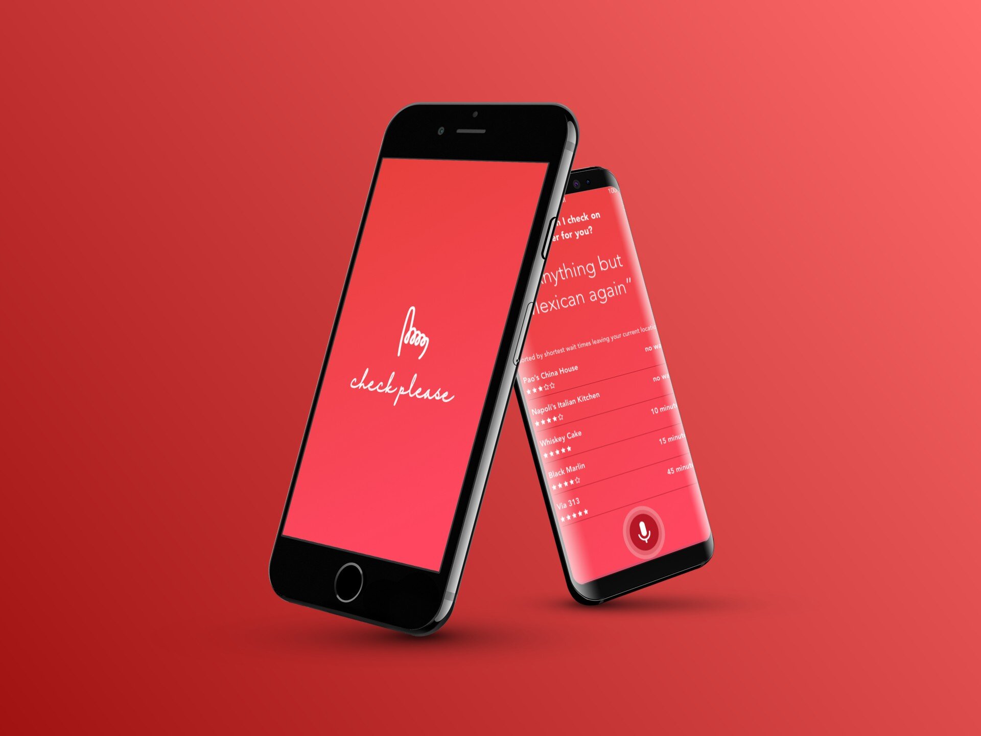
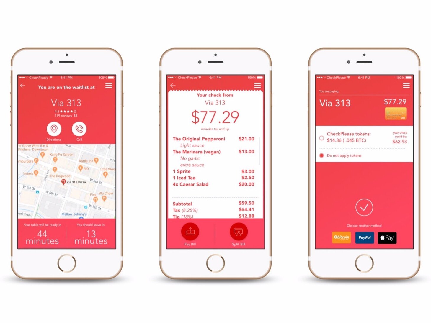
Check Please is a dining app that allows its users to manage their dining experience all from their phone. From booking a table to paying the check either in total or to be split amongst the party.
INSPIRATION4DESIGN:
The inspiration for this design was that moment when you ask for and then receive the check while dining out.
That moment you make eye contact with your server and raise your hand - one finger gently extended - signaling from across the room that you’re ready for the check is represented clearly in it’s form.
The single continuous stroke of the logo is reminiscent of one’s signature as they’re signing the check.
Lastly, the color red is softer than a McDonald’s red, but red nonetheless as color psychology reinforces the color as being one that stimulates appetite.
Packtracker is a white-label app for moving companies that allows their customers to accurate locate and track items in their personal inventory during a move. A label scan can reveal box contents as well as it’s current location. A search for a specific tagged item can reveal which box it lives in. All of this to aid in security and peace of mind during one of life’s most stressful events.
INSPIRATION4DESIGN:
Simple. It’s the box that, using simple RFID technology, talks back to you. Orange and yellow are used to create an upbeat palette. The logo itself serves two purposes, the first of which is the simple representation of a moving box, of which it is broadcasting information hence the wifi-esque lines; the second being a container for each unique code that is printed on box labels. This simple enclosure for that unique code allows every logo to work on behalf of the larger brand and reinforce its function.
Openbook is a room-booking application that resides on tablets mounted on the outside of conference rooms in an office environment. Openbook is connected to your office calendar and then sends visual cues to the tablets letting others know if the conference room is open for use or officially booked. Openbook allows anyone passing by to view who is in the meeting and what it pertains to, also allowing them to view available time slots to book that room all from the tablet.
INSPIRATION4DESIGN:
The name Openbook is playful in and of itself. It speaks to the function of it’s visual cues telling one if a room is open or booked. If the room is open, you can book it. Additionally, it’s an open book i.e. it tells you everything you need to know about a meeting in the past, present or future.
Borrowing a universal symbol, the stop light, it uses the ‘o’ and the ‘b’ vertically stacked to be the frames for the green and red lights.
Housed is a personal brand for a Dallas-based Keller Williams realty group. While KW realty groups can be called whatever they like and look different from one group to the next, it was asked of me to utilize the KW Red to maintain some semblance of brand recognition.
INSPIRATION4DESIGN:
Pineapples are also considered an expression of "welcome" throughout the South and symbolizes assets we appreciate in our home – friendship, hospitality and warmth. With that in mind and additional direction to keep a traditional symbol, it still had to feel modern and new. The font does both - keeping a warm nostalgic feel while utilizing a thicker modern, single-stroke line. The pineapple shape and design mimics that thought by retaining its recognizable shape through simplified leaf and pattern elements.
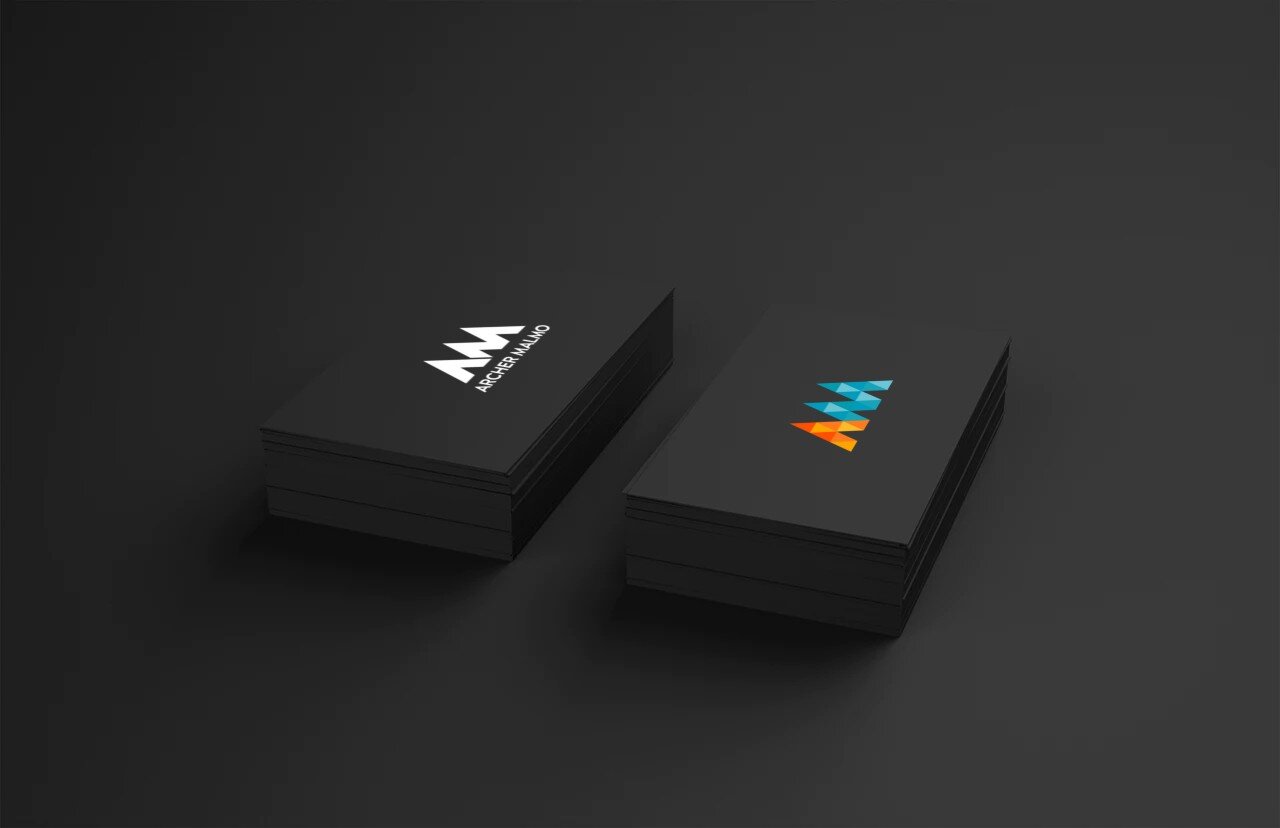
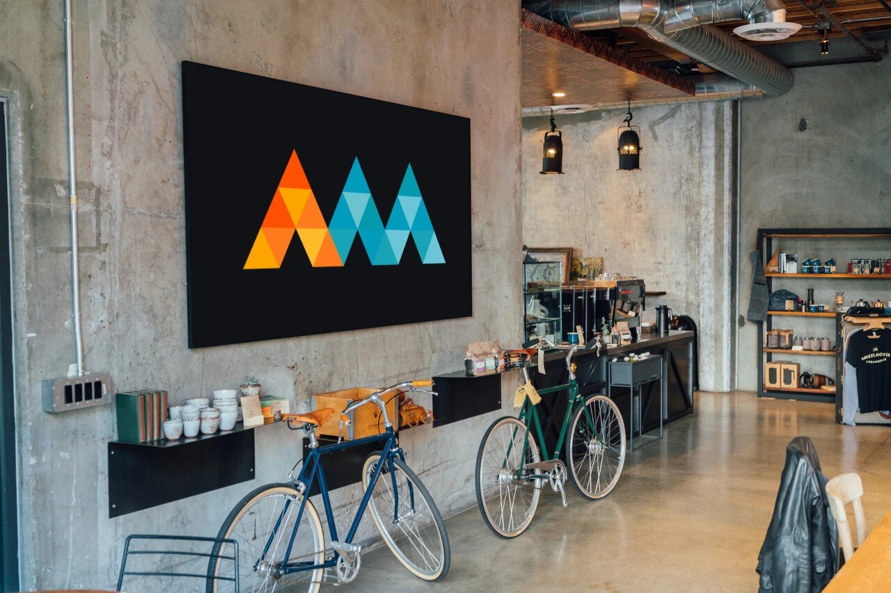
In mid-2019, ad agency Archer Malmo underwent a massive transformation. I created an entirely new branding suite to not only modernize the 60 year old agency, but reflect the diverse skillset that is required to serve our clients well.
INSPIRATION4DESIGN:
Our previous logo utilized a very heavy weight font, excessively masculine colors and had no single identifying mark and felt one-dimensional. The was a very poor representation of who we are.
I used that as fuel to better reflect the direction an agency in 2019 should be heading by first creating a singular mark unique to the name sake. Three peaks combine to form the A and the M which are differentiated by a legacy color (orange) combined with a new color that softens the masculinity to better reflect the employee mix of the agency. Those three peaks forming the two letters are made of 24 smaller triangles that represent the many departments and skillsets the agency has to offer. All of this, paired with another legacy color (grey) used for the logotype.
The logotype also moved in an opposite direction from the current logo by keeping its bold presence with all caps, but utilizing a far thinner stroke weight and simpler sans serif font to bring it into 2019 and beyond. This also allowed us to achieve a logo that gave equal share of voice to type and mark but still having a balance between the heavy and light weight elements.