
Your Custom Text Here
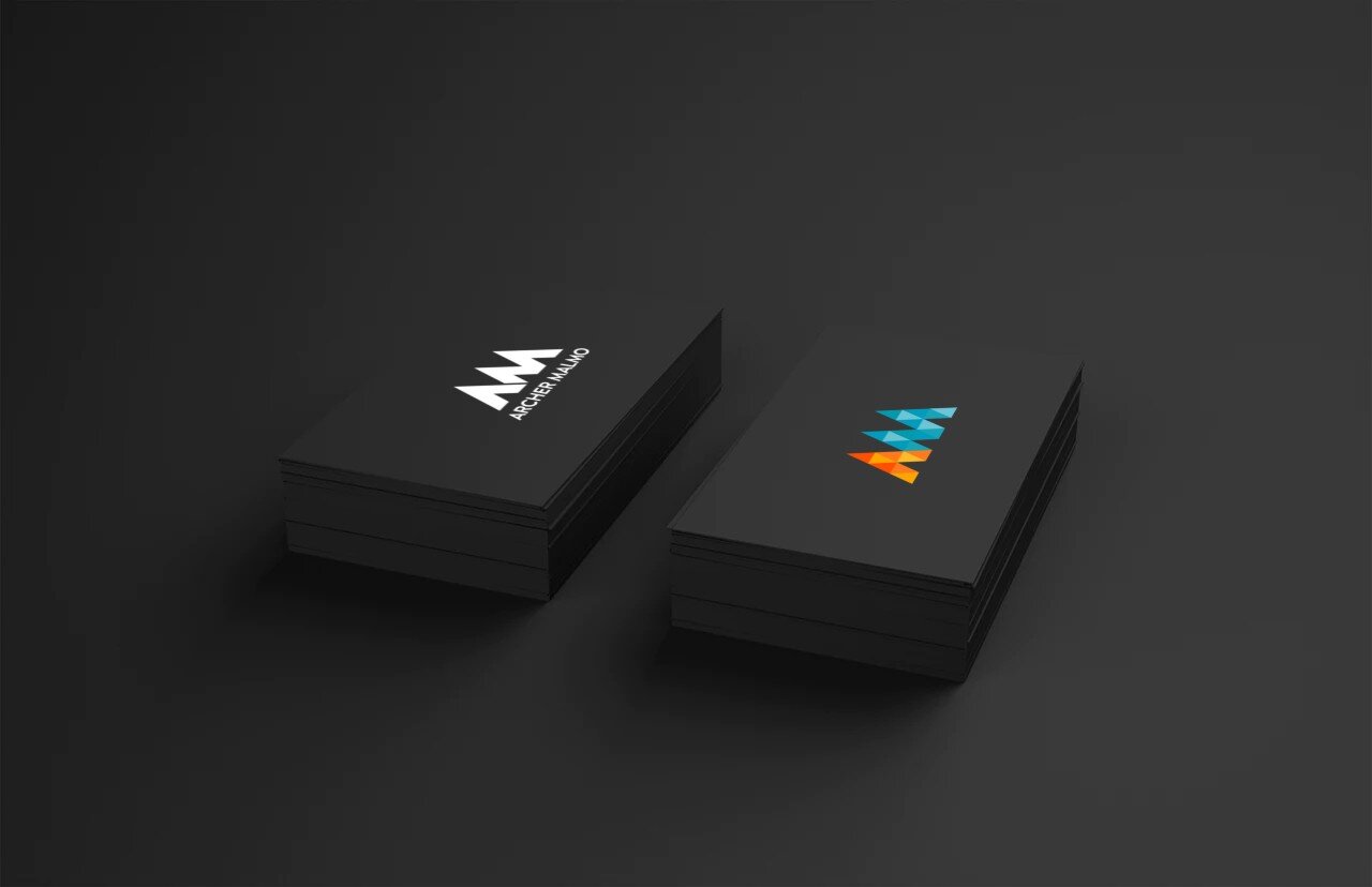
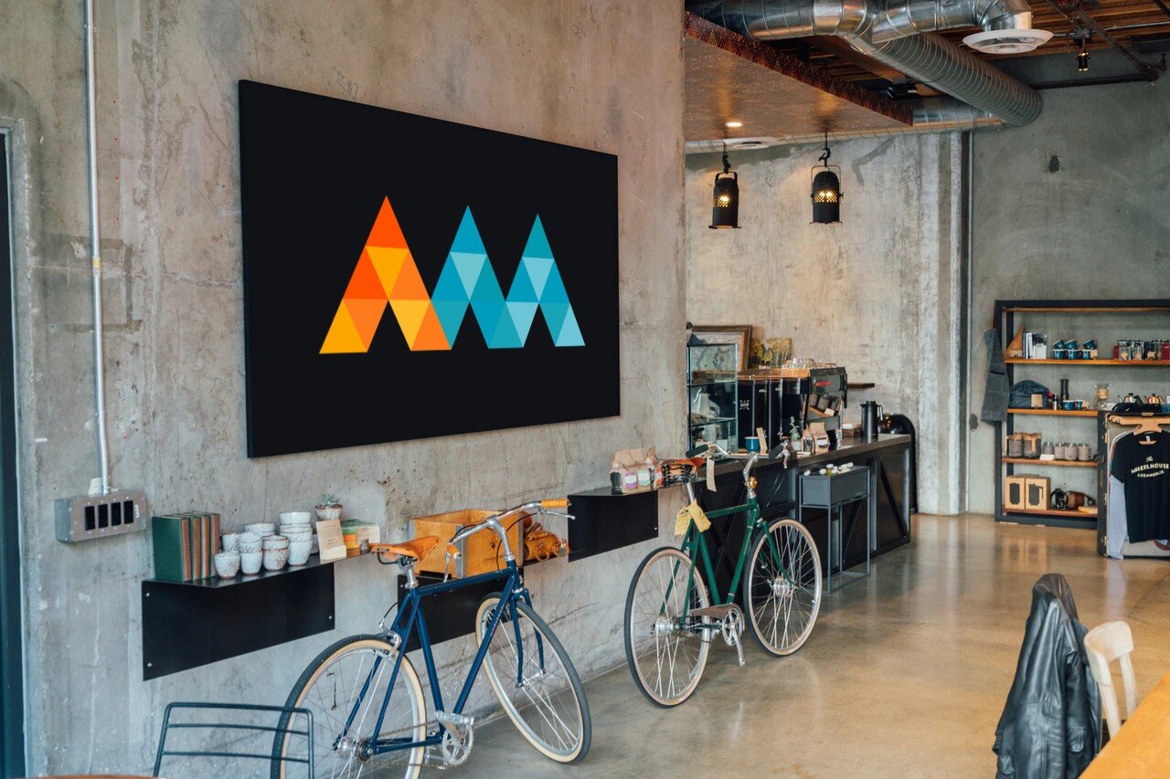
In mid-2019, ad agency Archer Malmo underwent a massive transformation. I created an entirely new branding suite to not only modernize the 60 year old agency, but reflect the diverse skillset that is required to serve our clients well.
INSPIRATION4DESIGN:
Our previous logo utilized a very heavy weight font, excessively masculine colors and had no single identifying mark and felt one-dimensional. The was a very poor representation of who we are.
I used that as fuel to better reflect the direction an agency in 2019 should be heading by first creating a singular mark unique to the name sake. Three peaks combine to form the A and the M which are differentiated by a legacy color (orange) combined with a new color that softens the masculinity to better reflect the employee mix of the agency. Those three peaks forming the two letters are made of 24 smaller triangles that represent the many departments and skillsets the agency has to offer. All of this, paired with another legacy color (grey) used for the logotype.
The logotype also moved in an opposite direction from the current logo by keeping its bold presence with all caps, but utilizing a far thinner stroke weight and simpler sans serif font to bring it into 2019 and beyond. This also allowed us to achieve a logo that gave equal share of voice to type and mark but still having a balance between the heavy and light weight elements.